Diff demo
deploydiff captures screenshots of your pages and compares them visually between deployments or across time. This page shows what a diff looks like in practice — with two real, browsable versions of the same page that have deliberate differences between them.
The two pages
We built a fictional product homepage called Nexus. Both versions are live and browsable:
| Version | URL | Role |
|---|---|---|
| Page A | /example/page-a ↗ | Baseline (reference) |
| Page B | /example/page-b ↗ | Candidate (new deployment) |
Open both in separate tabs and compare them — the changes are intentionally subtle. You might catch two or three, but it's unlikely you'd spot all four without a diff tool.
What changed
Four things are different between page A and page B:
- Button order — The two hero call-to-action buttons are swapped. In page A, "Get started" comes first; in page B, "See a demo" is first.
- Feature copy — The "Smart notifications" card description changed from "AI-powered priority filters" to "intelligent priority filters".
- Pricing limit — The Starter plan member limit dropped from "Up to 10 members" to "Up to 5 members".
- Hero spacing — The hero section vertical padding shrank (
py-24→py-16): 32 px off the top and 32 px off the bottom, so everything below the hero shifts up by 64 px.
The diff
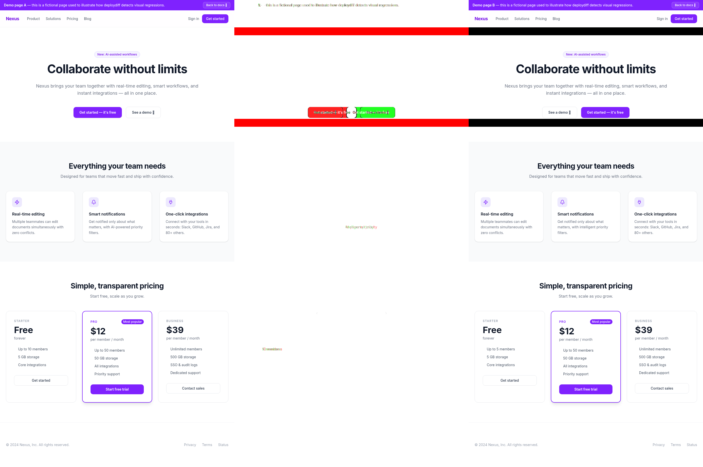
deploydiff highlights every changed pixel, making it impossible to miss any of the four differences above — including the spacing shift, which is the hardest to spot by eye.
Note
deploydiff is not made to compare two pages of the same site, but rather the same page across time or environments. The comparison made here across two different pages is for demo purposes only.